Your homepage should run the product
I rebuilt the Prompt Area homepage around the live component instead of copy about it. For a developer tool, the demo is not a section on the page. It is the page.
For a developer tool, the homepage is not where you describe the product. It is where you run it.
I just rebuilt prompt-area.com. The old homepage led with a headline and a paragraph explaining what the component does. The new one leads with the component itself, already full of real content: a Codex-style composer with a file attached, two @mentions, a /command, a #tag, and a line of markdown. Before you read a word of copy, you have watched the thing work.
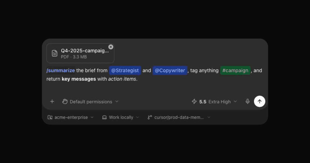
The hero, on load. No copy yet. You have already seen mentions, a command, a tag, markdown, and a file, in a layout you recognize.
Copy describes. A running component proves.
A landing page for a library has one job: convince a skeptical engineer in about ten seconds that this solves their problem. Copy cannot do that. "Rich text input with mentions and commands" is a claim. A cursor blinking inside a real input, where typing @ opens a dropdown and / fires a command menu, is evidence. Engineers do not buy claims. They poke at things.
So the redesign inverted the page. The hero is the live component. Everything else (the install command, the feature grid, the comparison to Tiptap and react-mentions) sits below it, in service of the thing you already saw running.
Seed it with real content, not lorem
The mistake most "live demo" sections make is shipping an empty input. An empty box proves nothing. You have to fill it with a believable scenario the moment the page loads.
The Prompt Area hero comes pre-populated:
- a /summarize command chip
- @Strategist and @Copywriter mention chips
- a #campaign tag
- a line of bold and italic markdown
- a PDF sitting in the attachment strip above the input
In one glance you see five features working together, inside a layout you already recognize. And because it is the real component and not a screenshot, you can start typing immediately and it responds.
Show the hard parts
The boring 20 percent is where a component earns trust: paste that keeps chips intact, undo that respects them, a file strip, IME composition. Seed the demo with exactly those so a skeptic sees them without having to go hunting.
The rest of the site followed
Once the homepage was the product, the old structure stopped making sense. It used to be one long scrolling page with a sidebar of anchor links, which is really a documentation site cosplaying as a landing page.
So I split it. A short marketing homepage that funnels into real docs. A dedicated page for every component, every example, and every built-in style, with the Claude Code and Codex composers each getting their own showcase. Three column docs with an "on this page" rail that tracks as you scroll. The homepage sells, the docs explain, and neither one pretends to be the other.
The honest part
I did the whole rebuild in an afternoon, driving an agent. That is worth saying plainly, because it changes the calculus. When a full redesign costs an afternoon instead of a sprint, "the homepage is just okay" stops being an acceptable answer. The bottleneck was never the code. It was deciding what the page should be.
And for a developer tool, that decision is simple. Stop describing your component. Run it.
Did this resonate?
Get new essays by email
Field notes on AI-native products, straight to your inbox. No spam, unsubscribe any time.