Agents should draw their work. Miro MCP lets them.
Agents now make more than anyone can read. Connect Claude Code or Codex to the Miro MCP and have them draw it instead. Five skills to copy.
By Ilko Kacharov, CTO & Co-founder, Juma Labs
- Published
- Words
- 1,882
- Reading
- 9 min
- Sections
- 05

My agents now produce more than I can read. One session is hundreds of tool calls. One afternoon is a new module, a benchmark, a pile of research notes and a design that changed twice along the way. I can't read all of it. I also can't stop checking it.
So I ask the agent to draw it.
A picture is small enough to check. A wrong arrow jumps out in a way a wrong sentence on page nine never does. With the , the agent draws straight onto a board, as real diagrams I can move, comment on and share with the team. That's the whole practice: let the agent do the work, then make it show you the work as a picture.
Agents write faster than people read
This isn't a feeling. Faros AI tracked more than 10,000 developers across 1,255 teams in 2025 and found that teams with high AI adoption produce 154% bigger pull requests and spend 91% longer reviewing them. 's March 2026 guidance says the time saved writing code "is often re-allocated to verification overhead".
The cost isn't only review time. It's losing the picture in your head. Simon Willison described it after letting agents build features he didn't review: "I no longer have a firm mental model of what they can do and how they work."
That mental model is the thing to protect. You don't need to read every line an agent wrote. You do need to know how the system fits together, how the important flows run, what just changed and why you chose it.
Diagrams always helped. They were just expensive.
The evidence that pictures help people understand software is old and consistent. In a experiment at Simula, the hardest maintenance task got 46% correct answers without diagrams and 89% with them. In a 2024 study, analysts given linked back to the code were 41% more correct on a security review.
The problem was cost. Microsoft researchers found developer diagrams were mostly throwaway "because of the high cost of changing whiteboard sketches to electronic renderings." Redrawing took a person an afternoon, so diagrams went stale a week after someone drew them.
An agent that has just done the work can draw it in a minute. So the diagram doesn't have to last. You ask for it when you need to understand something, check it, and draw a new one next time.
Connecting takes one command
Miro runs a remote server at https://mcp.miro.com/. You sign in with , so there's no API key to paste. You pick a Miro team when you sign in, and the agent can use the boards you can already open in that team.
. Either install Miro's plugin, which also brings Miro's own code-explain, code-review and code-spec skills:
claude plugin install miro@claude-plugins-officialOr register just the server:
claude mcp add --transport http miro https://mcp.miro.com/. One command, and it opens the sign-in page in your browser straight away:
codex mcp add miro --url https://mcp.miro.com/Two things to know first. Miro keeps one MCP connection per user: "if you auth into 3 clients, only the latest client connection will work." So connect each tool one way, not two.
The other is a daily limit, and every tool call counts. As of September 2026 that's 100 calls on Free, 500 on Starter, 2,000 on Business and 10,000 on Enterprise. Each figure in this post took a handful of calls. On Enterprise, an admin may need to switch MCP on first.
Miro's launch video shows the same idea from their side:
The tools changed a lot this month. In mid-September Miro retired fifteen old tools, including every diagram_*, layout_* and doc_* call. Now the agent writes plain SVG, and Miro turns it into real board items: sticky notes, shapes, and proper flowcharts, sequence diagrams, and class diagrams. Miro's reason is simple: "SVG sits in every model's training data."
Five pictures worth asking for
A skill is a Markdown file that tells the agent when and how to do one job. Claude Code reads them from ~/.claude/skills/ and Codex from ~/.agents/skills/. Each skill below installs with one line, and you can read the whole file before you do.
All five also live in a public repo, kachar/miro-agent-skills, so one command installs them into Claude Code, Codex, and the other agents skills.sh supports:
npx skills add kachar/miro-agent-skillsThe examples come from real work: the tool search I wrote about in Jev picks the right tool for an LLM and BM25 got Orama. Jev still needs one. The engine and its benchmark are open source, so every box in these pictures is public.
What the agent just did
Start with the session itself. I gave Claude Code an empty frame and asked it to draw how this article was being made:
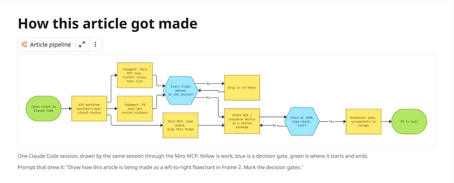
A transcript of that run is hundreds of tool calls long. The picture is eleven boxes, and the two decision gates are where the real work happened. That's the first thing I check.
miro-session-mapDraw what the current agent session did, or is about to do, as a flowchart on a Miro board - steps, parallel branches, decision gates and where it ended. Use when the user says "map this session", "draw what we just did", "document this process on the board", or wants a visual record of a long agent run before reviewing its output.
- skills.sh
- npx skills add kachar/miro-agent-skills --skill miro-session-map
- Claude Code
- mkdir -p ~/.claude/skills/miro-session-map && curl -fsSL https://kachar.dev/skills/miro-session-map/SKILL.md -o ~/.claude/skills/miro-session-map/SKILL.md
- Codex
- mkdir -p ~/.agents/skills/miro-session-map && curl -fsSL https://kachar.dev/skills/miro-session-map/SKILL.md -o ~/.agents/skills/miro-session-map/SKILL.md
Read the SKILL.md
---
name: miro-session-map
description: Draw what the current agent session did, or is about to do, as a flowchart on a Miro board - steps, parallel branches, decision gates and where it ended. Use when the user says "map this session", "draw what we just did", "document this process on the board", or wants a visual record of a long agent run before reviewing its output.
---

# Map this session on a Miro board

A long agent session is a process nobody watched end to end. This skill turns it into one
flowchart a human can check in thirty seconds.

## Before drawing

1. Ask for the board URL if you don't have one. If the user gave a frame link
   (`?moveToWidget=<id>`), read that frame first with `canvas_read_as_svg` and draw inside it.
2. Reconstruct the session from evidence, not memory: the conversation, `git log --oneline`,
   `git diff --stat`, files you created, subagents you started, tests you ran. Every node must map
   to something that happened (or, for a plan, something you will do next).
3. Keep it to 8-15 nodes. Merge small steps. If the session had more than 15 real steps,
   draw one frame per phase instead of one crowded diagram.

## Drawing

1. Call `canvas_get_canvas_composer_skill` first (it is required), then
   `canvas_load_format_skill` with `format_name: "diagramming"` and `notation: "flowchart"`.
2. One Mermaid `flowchart LR` inside a `<foreignObject data-type="diagram">`:
   - start and end nodes as stadiums `([...])`
   - work as rectangles, decision gates as `{{...}}` with labeled `Yes` / `No` edges
   - parallel work (subagents, background jobs) as sibling branches from the same node
   - loops that actually happened (a failed test, a re-fetch) as edges back to the gate
3. Label nodes with the concrete thing, not the category: "Subagent: benchmark research", not
   "Research".
4. Under the diagram, add one line with the prompt that produced it, so the board explains itself.

## Miro gotchas

- A diagram widget sizes itself from the Mermaid source and cannot be moved or deleted with the
  canvas tools after creation. Choose its position first, then fit the frame around the rendered
  size.
- Its title chip floats just above it. Leave about 64px of empty space above the diagram.
- Children of a frame use frame-relative coordinates.
- Quote any label that starts with `/` (`a["/api/orders"]`) or Mermaid draws a parallelogram.

## Finish

Report the frame link (`<board>?moveToWidget=<frame id>`) and one sentence on what the map shows
that the transcript hides, such as a gate that failed twice.
How the system fits together
This is the map you'd want on day one of a new codebase: what runs where, what calls what, and what writes data. Here is the Jev tool search, drawn from its repo:
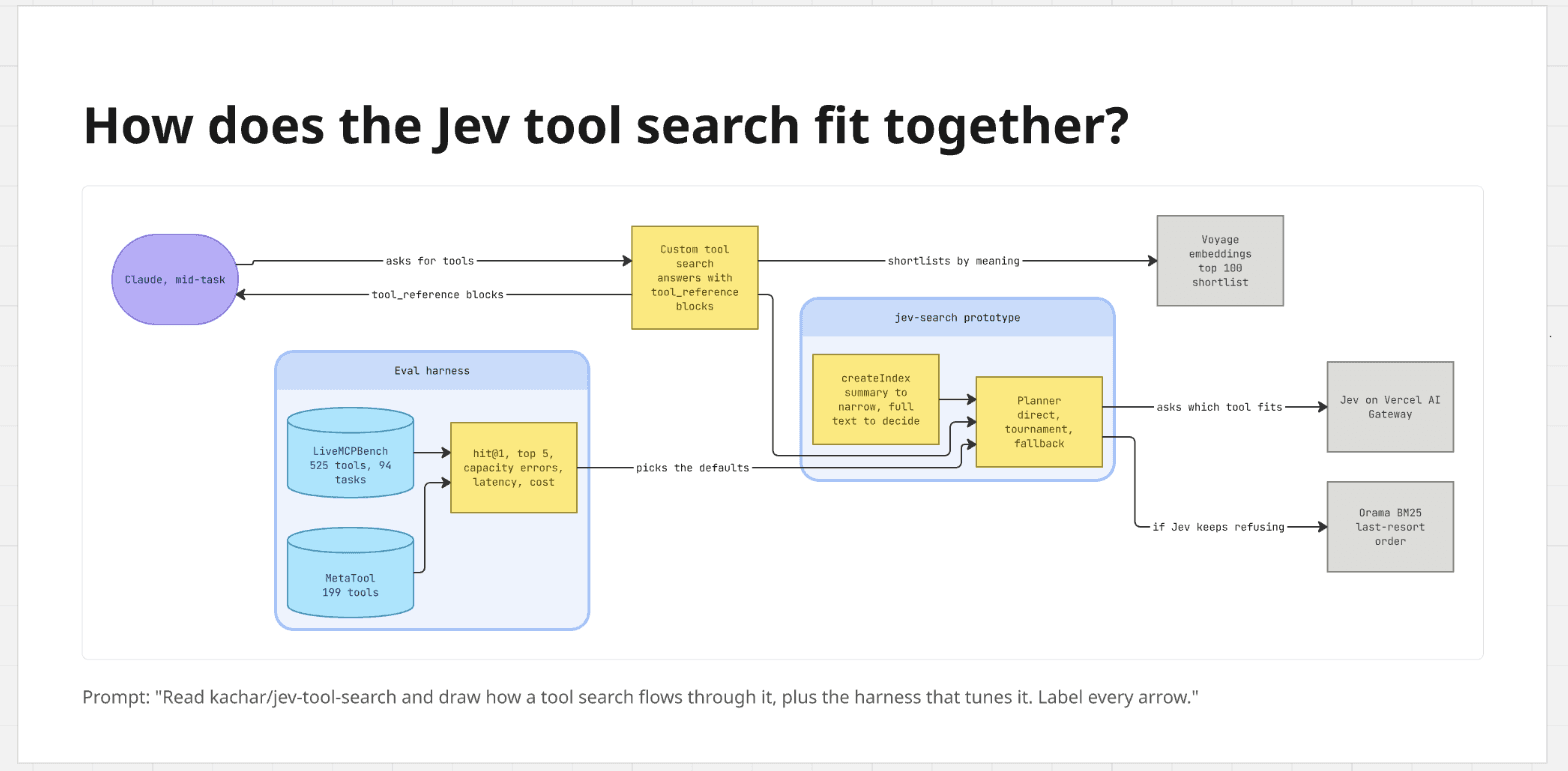
The box I'd have missed in the code is the at the bottom left. It never serves a search, yet every default the planner uses was picked by measuring with it. In the picture, that arrow is hard to miss.
One warning. A good map of your own production system lists every endpoint, login path and data store. That's the first page of an attacker's notes. Draw it on a board only your team can open.
miro-system-mapRead the current repository and draw how the system is put together today as a block diagram on a Miro board - runtimes, services, data stores, external APIs and the arrows that write data. Use when the user asks to "draw the current setup", "diagram the architecture", "show me how this repo fits together", or is onboarding onto an unfamiliar or agent-written codebase.
- skills.sh
- npx skills add kachar/miro-agent-skills --skill miro-system-map
- Claude Code
- mkdir -p ~/.claude/skills/miro-system-map && curl -fsSL https://kachar.dev/skills/miro-system-map/SKILL.md -o ~/.claude/skills/miro-system-map/SKILL.md
- Codex
- mkdir -p ~/.agents/skills/miro-system-map && curl -fsSL https://kachar.dev/skills/miro-system-map/SKILL.md -o ~/.agents/skills/miro-system-map/SKILL.md
Read the SKILL.md
---
name: miro-system-map
description: Read the current repository and draw how the system is put together today as a block diagram on a Miro board - runtimes, services, data stores, external APIs and the arrows that write data. Use when the user asks to "draw the current setup", "diagram the architecture", "show me how this repo fits together", or is onboarding onto an unfamiliar or agent-written codebase.
---

# Draw the current system as a block diagram

The goal is the picture a new engineer would draw after a week, produced from the code in ten
minutes. Draw what the code does today, not what the README says it should do.

## Gather facts from the code

1. Entry points: framework routes, API handlers, CLIs, workers, cron jobs.
2. Data: ORM schemas, migrations, connection env vars (names only, never values).
3. Outbound calls: SDK imports and `fetch` targets (email, payments, analytics, LLM providers).
4. Deployment: `vercel.json`/`vercel.ts`, Dockerfiles, IaC, CI workflows.
5. For every arrow you plan to draw, find the line of code that makes the call. If you can't find
   it, leave the arrow out.

## Drawing

1. Call `canvas_get_canvas_composer_skill` first, then `canvas_load_format_skill` with
   `format_name: "diagramming"`, `notation: "flowchart"`.
2. One Mermaid `flowchart LR`:
   - a `subgraph` per place the code runs (for example "Vercel: Next.js", "Worker", "Browser")
   - data stores as cylinders `[(...)]`
   - third-party services in one neutral color, your code in one color, data in a third
   - who calls whom as arrows. Label every arrow that writes or sends data
     ("writes orders", "sends receipts"); leave reads unlabeled
3. 10-15 nodes. If it needs more, draw a top-level map plus one frame per subsystem.
4. Title the frame with a question the diagram answers ("What is <project>, today?").
5. Add the prompt as a caption under the diagram.

## Miro gotchas

- Quote labels that start with `/` or contain brackets: `blog["/blog/[slug]"]`.
- Diagram widgets size themselves, and the canvas tools can't move them after creation. Size the
  frame to the rendered diagram, not to what you authored.
- Leave about 64px above the diagram for its floating title chip.

## Keep it private

A system map lists every endpoint, auth path and data store in one picture. That's the first page of a
threat model. Draw it on a board only your team can open, and never paste it into public docs or posts.

## Finish

Share the frame link and list anything surprising the map exposed, such as a service two
subsystems both write to, or a dependency no one documented.
How one flow runs
A sequence diagram answers "what happens when," which is most of what you want to know about code you didn't write. Here is one Jev search, including what happens when the provider refuses:
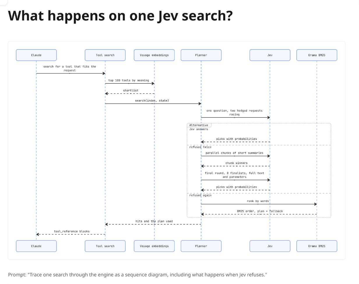
Those three branches are the whole design of the engine, and the picture puts them in one box with three rows. When a search is slow, that box tells you where to look.
miro-flow-traceTrace one request, job or user action through the code and draw it as a UML sequence diagram on a Miro board, including auth branches, retries and error paths. Use when the user asks "what happens when...", "trace this flow", "how does X get from A to B", or needs to review a change to a request path they didn't write.
- skills.sh
- npx skills add kachar/miro-agent-skills --skill miro-flow-trace
- Claude Code
- mkdir -p ~/.claude/skills/miro-flow-trace && curl -fsSL https://kachar.dev/skills/miro-flow-trace/SKILL.md -o ~/.claude/skills/miro-flow-trace/SKILL.md
- Codex
- mkdir -p ~/.agents/skills/miro-flow-trace && curl -fsSL https://kachar.dev/skills/miro-flow-trace/SKILL.md -o ~/.agents/skills/miro-flow-trace/SKILL.md
Read the SKILL.md
---
name: miro-flow-trace
description: Trace one request, job or user action through the code and draw it as a UML sequence diagram on a Miro board, including auth branches, retries and error paths. Use when the user asks "what happens when...", "trace this flow", "how does X get from A to B", or needs to review a change to a request path they didn't write.
---

# Trace one flow as a sequence diagram

A sequence diagram answers one question: in what order do these parts talk, and what happens when
something fails? Pick exactly one flow per diagram.

## Trace it in the code

1. Start at the entry point the user named (route, handler, queue consumer, CLI command).
2. Follow the calls in order. For each hop write down the caller, the callee, the message (the
   function or HTTP call) and the file it happens in.
3. Record the branches that matter: auth paths, cache hit or miss, retries, the error the
   caller actually sees. Skip logging and metrics.
4. Participants are components (route handler, auth library, DB), not individual functions.
   Five to seven participants is plenty.

## Drawing

1. Call `canvas_get_canvas_composer_skill` first, then `canvas_load_format_skill` with
   `format_name: "diagramming"`, `notation: "uml_sequence"`.
2. One Mermaid `sequenceDiagram`. Use `alt` / `else` for branches and a nested `alt` for the
   failure case inside a branch. Dashed arrows (`-->>`) for responses. Remember that the
   body is XML, so `->>` not `->>`.
3. Message labels are the real call names from the code (`verifySession`, `POST /orders`),
   so a reviewer can grep for them.
4. Sequence diagrams render tall. Give the frame at least 1,300px of height and check the
   rendered size before placing the caption.

## Keep it private

Auth flows are the part of a system an attacker most wants mapped. Keep these frames on a team-only board,
and leave secrets out of the labels: name an env var if you must, never its value.

## Finish

Share the frame link and name the one step where you'd put a breakpoint or a test if this flow
broke in production.
What changed
Agents change a lot at once. The useful question is small: what did it look like before, and what does it look like now? This is the change from the second Jev post, drawn as two rows:
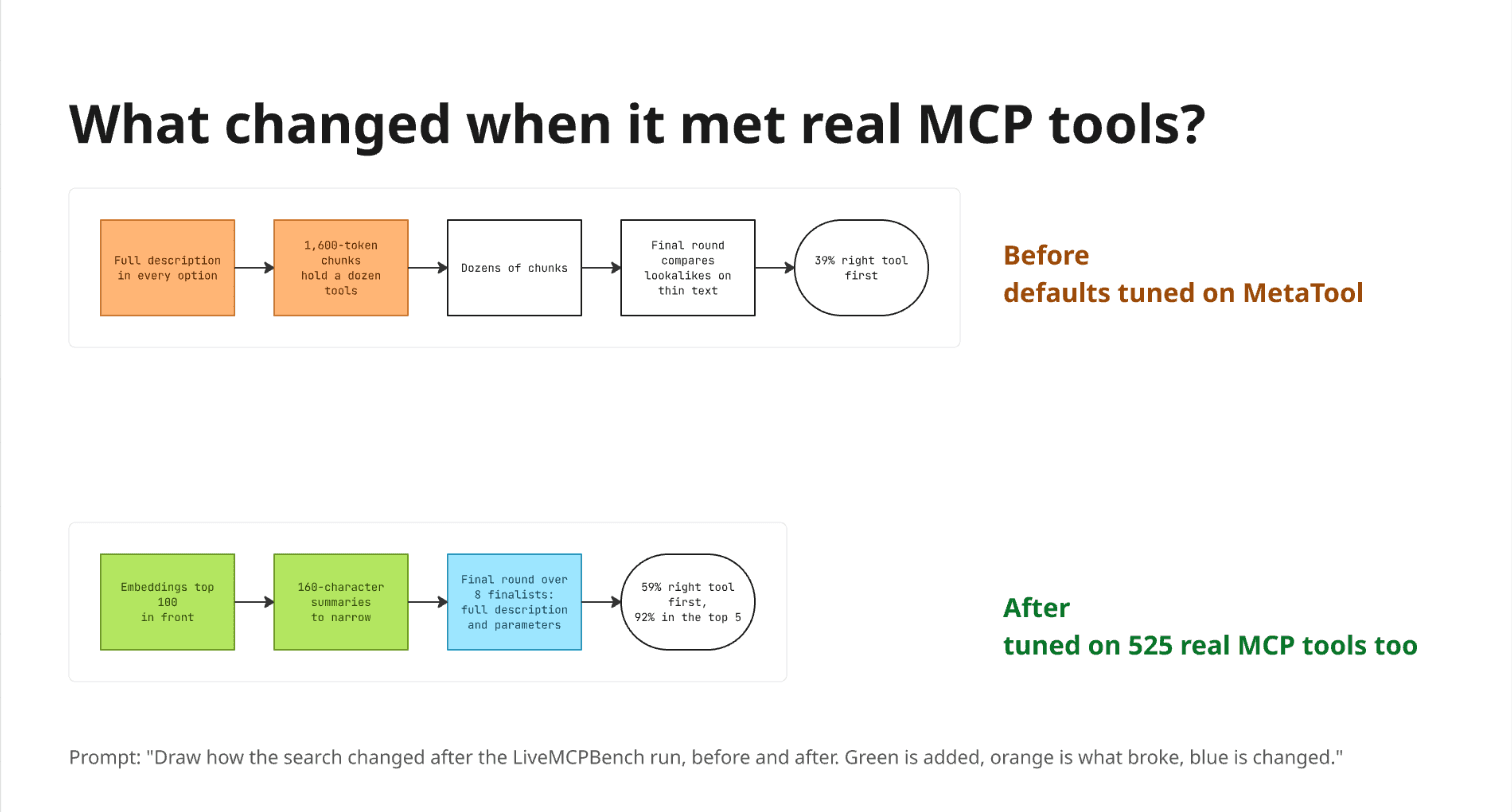
In the post, that change took several paragraphs to explain. The two rows show it in one look: orange is what broke, green is what was added, blue is what was reworked.
miro-change-mapDraw what an agent changed as a before-and-after map on a Miro board - which parts were added, removed or rewired, and what that did to the behaviour or the numbers. Use when the user asks "what did you change", "show me before and after", "what's different now", or has to understand a large agent-made change (a refactor, a migration, a new pipeline, a tuned config) without reading all of it.
- skills.sh
- npx skills add kachar/miro-agent-skills --skill miro-change-map
- Claude Code
- mkdir -p ~/.claude/skills/miro-change-map && curl -fsSL https://kachar.dev/skills/miro-change-map/SKILL.md -o ~/.claude/skills/miro-change-map/SKILL.md
- Codex
- mkdir -p ~/.agents/skills/miro-change-map && curl -fsSL https://kachar.dev/skills/miro-change-map/SKILL.md -o ~/.agents/skills/miro-change-map/SKILL.md
Read the SKILL.md
---
name: miro-change-map
description: Draw what an agent changed as a before-and-after map on a Miro board - which parts were added, removed or rewired, and what that did to the behaviour or the numbers. Use when the user asks "what did you change", "show me before and after", "what's different now", or has to understand a large agent-made change (a refactor, a migration, a new pipeline, a tuned config) without reading all of it.
---

# Map a change as before and after

An agent can change more in an hour than a person can read in a day. The question a human needs
answered is small: what did it look like before, what does it look like now, and what did that do?

## Find the change, don't guess it

1. Work from evidence: `git diff --stat <base>...HEAD`, the files you touched, the config or
   prompts you edited, the benchmark or test output before and after.
2. Name the unit that changed. It is usually a flow (how a request moves), a structure (which
   parts exist and who calls whom) or a setting (the defaults a system runs with).
3. Write the before in three to six steps and the after in three to six steps, in the same
   vocabulary, so the two rows can be compared box by box.
4. If a number moved (accuracy, latency, cost, error rate), put the before and after values in
   the last box of each row. Only use numbers you measured or can point to.

## Drawing

1. Call `canvas_get_canvas_composer_skill` first, then `canvas_load_format_skill` with
   `format_name: "diagramming"`, `notation: "flowchart"`.
2. Draw two separate Mermaid `flowchart LR` diagrams in one frame, "Before" on top and "After"
   below it. (Miro lays out one diagram with two subgraphs side by side, which gets too wide.)
3. Colors: added = green, removed or broken = orange, changed = blue, unchanged = no fill.
4. Put a bold "Before" and "After" label next to each diagram. Diagram titles only show on hover.
5. Title the frame with the question it answers ("What changed when it met real data?") and
   add the prompt as a caption.

## Miro gotchas

- Miro treats every diagram as a 1600x900 box when you resize a frame, even though it renders
  smaller. Leave the frame at least that tall below the lowest diagram's top edge.
- Leave about 64px above each diagram for its floating title chip.

## Finish

Share the frame link and name the one box a reviewer should check first, usually the most
important green or orange one.
The decision
Hard calls usually come down to a few numbers pulling in different directions: accuracy, cost, speed. Miro has no chart widget, so this skill builds bars out of shapes, highlights the option you picked, and writes the decision underneath. These are the results from the first Jev post:
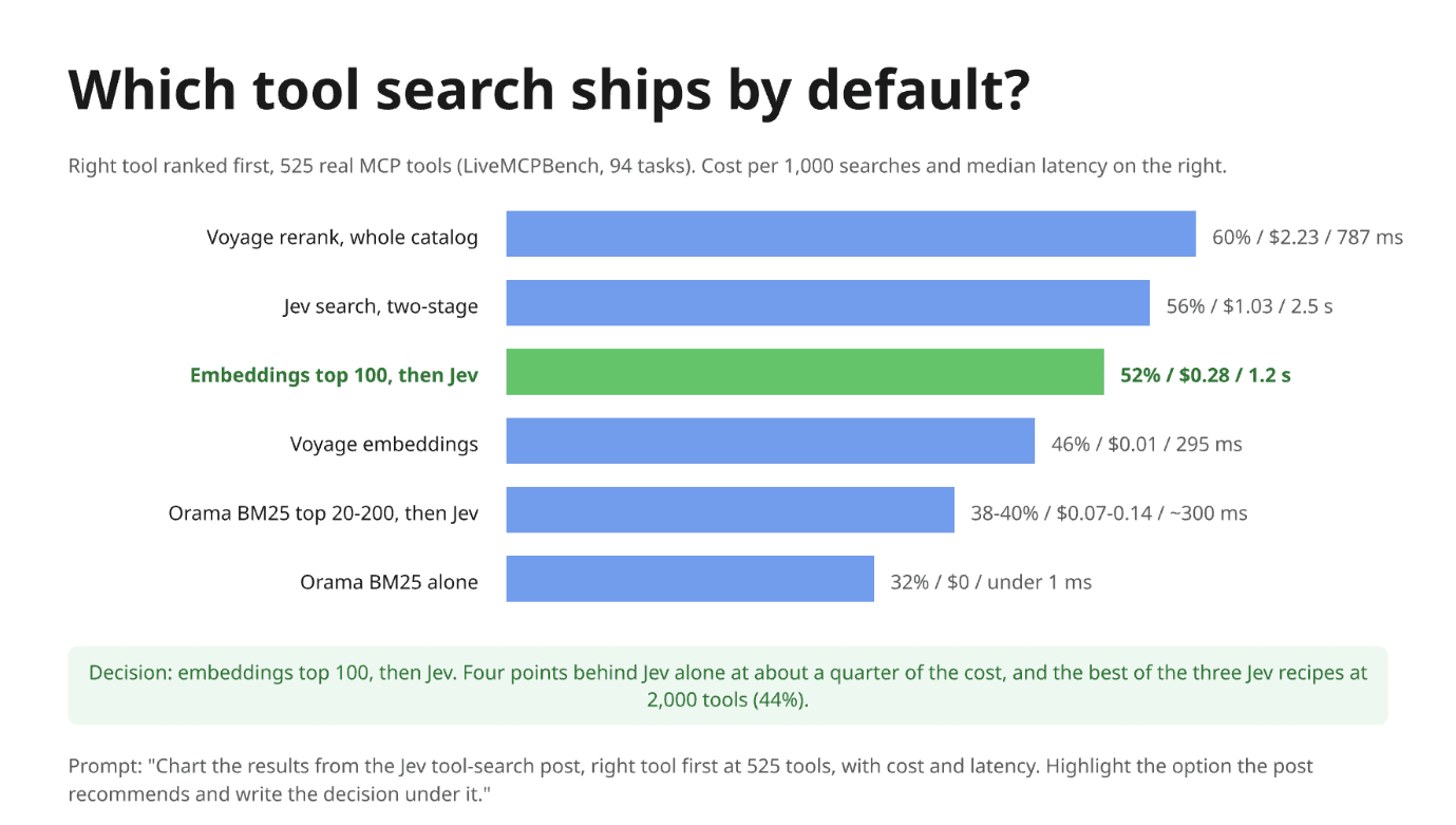
The decision fits in one sentence, and the reason sits next to it. People who will never open the results table can still see the trade-off and argue with it.
miro-decision-chartTurn the numbers behind a hard technical decision into a chart on a Miro board, with the chosen option highlighted and the decision written underneath. Use when the user asks to "chart these results", "help me decide between", "visualize this benchmark/comparison", or needs to explain a trade-off (accuracy vs cost vs latency) to people who won't read the raw table.
- skills.sh
- npx skills add kachar/miro-agent-skills --skill miro-decision-chart
- Claude Code
- mkdir -p ~/.claude/skills/miro-decision-chart && curl -fsSL https://kachar.dev/skills/miro-decision-chart/SKILL.md -o ~/.claude/skills/miro-decision-chart/SKILL.md
- Codex
- mkdir -p ~/.agents/skills/miro-decision-chart && curl -fsSL https://kachar.dev/skills/miro-decision-chart/SKILL.md -o ~/.agents/skills/miro-decision-chart/SKILL.md
Read the SKILL.md
---
name: miro-decision-chart
description: Turn the numbers behind a hard technical decision into a chart on a Miro board, with the chosen option highlighted and the decision written underneath. Use when the user asks to "chart these results", "help me decide between", "visualize this benchmark/comparison", or needs to explain a trade-off (accuracy vs cost vs latency) to people who won't read the raw table.
---

# Chart a decision

A decision chart shows the options, the one you picked, and one sentence explaining why, in that
order. It is not a dashboard.

## Get the numbers right first

1. Take numbers only from a source you can point to: a benchmark output file, a query result, a
   design doc, a spreadsheet. Record where each one came from.
2. Choose one primary metric for the bars (accuracy, p50 latency, monthly cost). Secondary
   metrics go in a text label next to each bar, not in extra bars.
3. Sort options by the primary metric. Keep ranges as ranges ("38-40%"), not midpoints.

## Drawing

Miro has no native chart widget, so build a horizontal bar chart from shapes. The canvas SVG
format supports it well:

1. Call `canvas_get_canvas_composer_skill` first and use the Bright Paper palette it returns.
2. One frame. Title = the decision as a question ("Which tool search ships by default?").
   A one-line subtitle states the metric, the dataset and the unit.
3. Per option: a right-aligned `textArea` label, a `rect` bar whose width is proportional to the
   value (fix one scale, such as 14px per percentage point, and use it for every bar), and a
   `textArea` after the bar with the value and the secondary metrics separated by " / ".
4. Every bar in one neutral color, the chosen option in green with a bold label.
5. Under the bars, a light green rounded rect with the decision and the one reason that settled
   it ("four points behind the best at a quarter of the cost").
6. Caption with the source of the numbers.

## Finish

Share the frame link and state which number would change the decision if it moved, so the chart
can be redrawn when that number is re-measured.
A picture is only as good as its arrows
Miro's own FAQ admits that layouts from scratch "may need a couple of refinement passes." Mine did. A diagram sizes itself and can't be moved once it's on the board. A label that starts with / turns a box into a parallelogram. One before-and-after came out as a single column two screens tall. None of that is hard to fix, and the skills above already know about it.
The part that matters is honesty. A diagram can be wrong in a more convincing way than text can.
Check the arrows, not the colors
Every arrow should point to a line of code, and every number to a command or a file you can open. A picture that follows both rules is easier to check than the work it summarizes. One that doesn't is a nicer-looking hallucination.
It's the same trade I argued for in write the done-condition, not the prompt. You can't check everything an agent produces anymore, so you check something small enough to verify.
Let the agent do the work. Then make it draw the work.
Glossary
Terms
- dataflow diagram
- A diagram showing how data moves between the parts of a system: where it comes from, what processes change it and where it is stored.
- DORA
- A long-running research program on software delivery performance. Its metrics, such as how often teams deploy and how often changes fail, are an industry yardstick for engineering teams.
- ERD
- Entity-relationship diagram: a chart of the things a database stores, such as users and orders, and how they relate to each other.
- eval harness
- Code that runs a system against a fixed set of test cases and records the scores, so different approaches can be compared fairly and repeatably.
- UML
- Unified Modeling Language: a standard set of diagram types for drawing how software is structured and how its parts interact, such as class and sequence diagrams.
Tools
- Claude Code
- Anthropic's agentic coding tool that reads a codebase, edits files and runs commands, in the terminal, IDEs, a desktop app and the web.
- Codex
- OpenAI's coding agent, which runs in the terminal and is also offered in IDEs and the cloud.
- Cursor
- An AI coding tool that uses agents to build, test and change software.
- Jev
- TypeSafe AI's decision model. It writes no free text: given a situation and a question with named options, it returns a probability for each option.
- MCP
- Model Context Protocol, an open standard for connecting AI applications to external data sources, tools and workflows.
- Mermaid
- A diagramming tool that renders flowcharts, sequence diagrams and other charts from a simple text syntax.
- Miro
- A collaborative online whiteboard for diagramming, planning and brainstorming, where teams work together on a shared canvas.
- Miro MCP
- Miro's MCP server. It lets AI agents such as Claude read and create content on Miro boards so people can see and edit the result together.
- OAuth
- The industry-standard protocol for authorization. It lets an app get limited access to a user's account on another service without handling the user's password.